By Rachael Smith, AICP, via Next City, March 26, 2021
Walk around your neighborhood and count the house or building colors you see. Four million hues of grey? Check. Lots of tans and browns? Definitely. An abundance of white and off-white? Absolutely. The occasional red door? You got lucky.
Even many beautiful brick buildings are muted canvases just waiting for a touch of hue and vibrancy in the window frames, doors, and accents. While not all buildings and homes should be altered, particularly those with historic value, there are many structures in cities that would look far nicer with a touch of color. Is that subjective? Of course it is! But I believe it is important we all take a hard look at our collective “fear of color,” manifested throughout our urban palette, and have an honest discussion about what we can do to cheer up our cities.
 Much of cities’ avoidance of color is rooted in colonial and Puritan roots. In some European cultures, white is often seen as pure and good, while color has often been linked to the primitive and the superficial. Goethe, a German playwright and novelist, captured the origins of the European anti-color stance when he wrote, “Men in a state of nature, uncivilized nations, and children, have a great fondness for colors in their utmost brightness,” whereas “people of refinement” avoid such vivid and saturated colors. This historic association of good taste with quiet colors has led to neutrals as a sign of moral superiority.
These negative associations with color still exist today and are often codified in our communities. Just check out the painting guidelines in a nearby homeowner’s association or within municipal design guidelines and you’ll see this fear in play. When color is used, there is a sense that it must be controlled — a pop of neutral color is acceptable, but a large dose of color is oftentimes restricted.
We also see this tendency to neutrals playing out in neighborhoods that are gentrifying — the older houses are rehabbed or replaced with homes that are typically white or shades of gray. In Chicago’s Pilsen neighborhood, a 2019 exhibit entitled Peeling off the Grey at the Mexican Museum of Art explored this topic — a commentary on the new homes and homeowners stripping away the color from this traditional Mexican-American neighborhood.
With this whitewashing comes another very worrisome trend — the painting over of bright and beautiful murals that have historically celebrated the culture of a neighborhood. In one of the most notorious examples in Pilsen, a developer painted over a famously colorful mural by artist Ray Patlan at the former Casa Aztlan community center. Following community outrage, the developer commissioned Patlan to return and recreate a portion of the mural on its façade, but on only one side of the building.
The erasure of murals celebrating Chicano culture is also prevalent in Los Angeles’ rapidly gentrifying Highland Park neighborhood, where prominent murals have frequently been whitewashed, despite a 2013 city ordinance designed to protect them. The City responded to attacks from local neighborhood groups that accused them of supporting developers in mural removal by commissioning Latino artists to repaint removed murals — an endeavor that was fraught with issues of compensation and authenticity.
As America begins to come to terms with many of the structural systems and policies built on racism and colonialism, we need to ask ourselves how the aesthetics of our built environment have been impacted by these same forces and what are the things that we as planners and designers can do to combat this through urban design.
ONE: Design for changing times.
Historic preservation in cities is critical to maintaining the collective memory of a place, but the safeguarding of buildings exactly as they are, or with minor and “tasteful” updates, is not necessarily in line with the inevitable tradition of design evolution. While there are some places that should be maintained, these must be paired with a growing openness to new and different design aesthetics in areas that can incorporate some color.
TWO: Look to international inspiration.
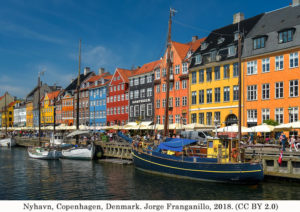
Americans have been a fan of European plazas for a while now — what about Colombian streets and Brazilian parks as models for color in the public realm? There are plenty of examples of places all over the world that should teach us that color is nothing to fear, and in fact, should be embraced. Colorful places have historical precedent as a way to bring people joy and happiness — particularly in winter cities like Copenhagen that experience extraordinary grayness throughout the year.
THREE: See the value of color in economic and community development.
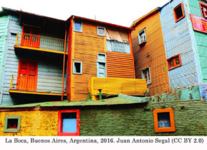
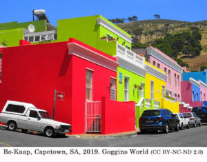
Colorful cities and neighborhoods, like La Boca in Buenos Aires and Bo-Kaap in Cape Town, have put themselves on the tourism map by being vibrant destinations.
 U.S. cities like San Francisco and Charlotte have made a name for themselves with their colorful streets.
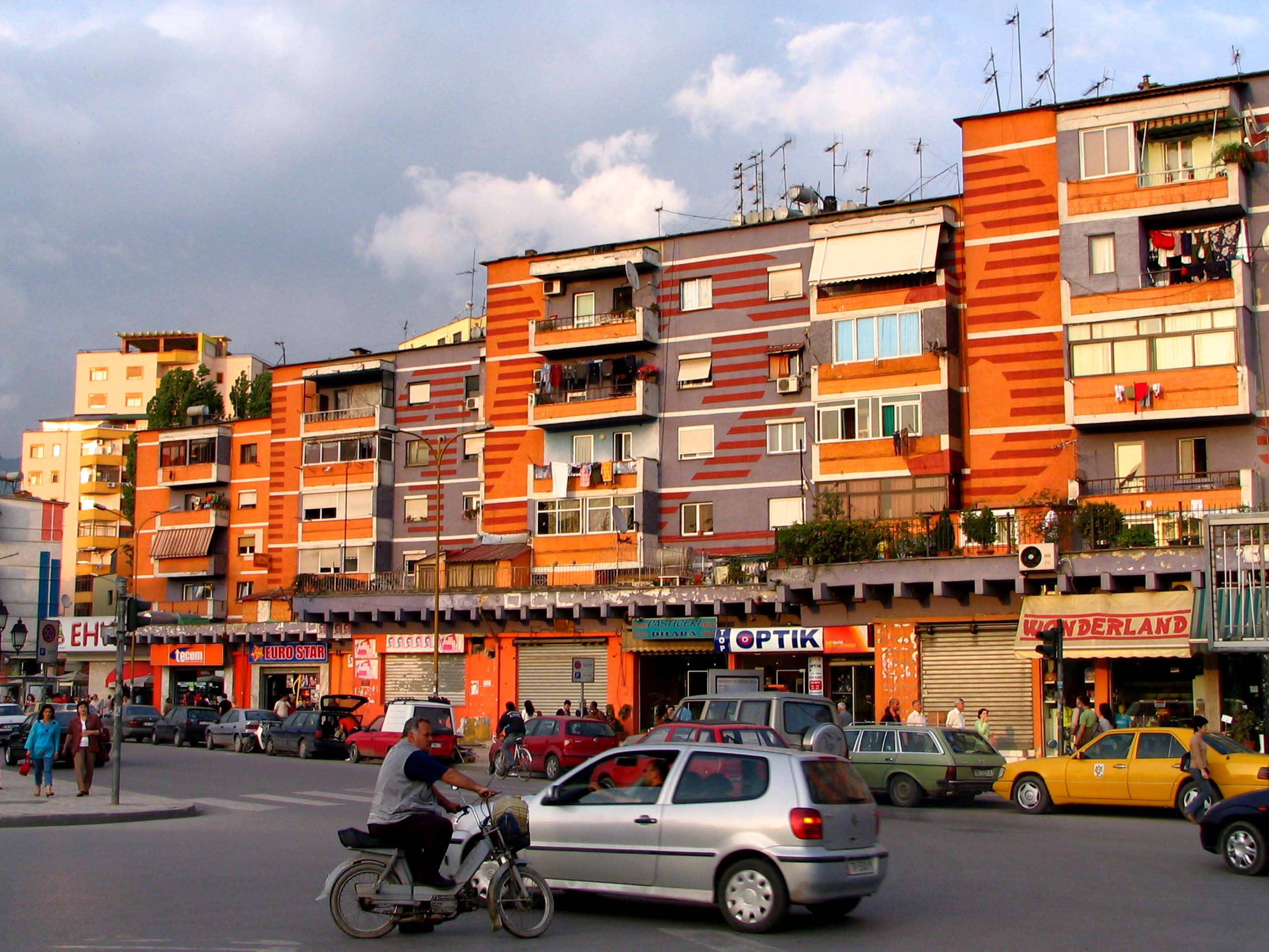
 What if we saw color as an economic and community development tool — a way to attract residents and visitors and improve quality of life? As Ingrid Fetell Lee highlights in her book, Joyful, the city of Tirana, Albania, is an excellent case study of color as community development.
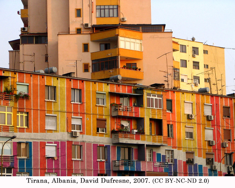 In the year 2000, the city’s new mayor took office after decades of high crime, corruption, and a bleak economic outlook. His first mayoral directive? Paint. Bright, colorful paint all over the city, laid on by municipal workers. That first public investment spread, and to public and private buildings alike. And quickly, there was a change far bigger than the pops of color. People stopped littering and started gathering in cafes. They took the bars off their windows, claiming the streets felt safer, and started dreaming of a new city. Nothing had changed, yet everything had changed. This place was theirs, and a greater sense of ownership and optimism emerged. It is a telltale example of the power of joy as infectious.
Design aesthetics that focus on sophistication, modernism, and order all have their place — I can’t argue with the joy of harmony. But whom does this mainstream aesthetic leave behind, and who is not welcome in that vision for our cities? Next time you walk down a city street, consider the words of Swiss painter Johannes Itten: “Color is life; for a world without colors appears to us as dead.” And then think about how you can introduce a little or a whole lot of color to liven up your community.
 Rachael Smith, AICP, is the Co-founder of All Together, a women-owned design studio focused on community branding, engagement, and placemaking whose work can be found in public spaces, on signage, and along trails in communities across the country. She holds a master’s in sustainable urban development from DePaul University and a BS in art/graphic design from the University of Wisconsin, Madison. You can reach her at rsmith@alltogetherstudio.com.
A version of this article appeared in Next City. Republished with permission.
