This article was published earlier by Common Edge, January 3, 2023. Republished with permission.
By Emily B. Marthinsen
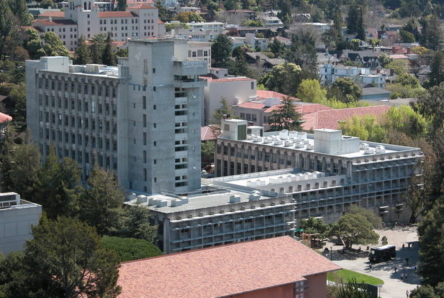
It’s finally time to write this down. For years—in meetings, on campus tours, and in informal conversations—I have talked about the University of California Berkeley’s Wurster Hall, now Bauer Wurster Hall, encouraging people to see and to appreciate the significance, and the beauty, of this building. It hasn’t been an easy case to make.
Bauer Wurster Hall is the home of the school’s College of Environmental Design (CED). Originally, it housed the departments of architecture, landscape architecture, planning, and design. The building was purpose-designed and built for the CED, a new college founded in 1959 that brought these departments together for the first time. William Wurster, for whom the building was originally named, was the college’s founding dean and the building’s visionary client.
I first saw Wurster Hall in 1976 when I arrived at Berkeley to attend architecture graduate school. The building, then just over a decade old, was already being called out as one of the ugliest on campus, with special head-shaking over its being the home of the Department of Architecture. I didn’t quite see it that way, but I was too busy in the building’s studios and classrooms to pay much attention to its design. As far as I can remember, although the building’s faculty-architects were still present, they didn’t discuss the building with us. We were certainly aware of the building’s unusual character. I once saw a photo from the late 1960s, when students placed huge images on the sun shelves, turning the building’s façade into a giant vending machine. But mostly, for three years I experienced Wurster Hall as an intense communal workplace, the place where I learned to be an architect and where I developed many of the close personal and professional relationships of my career and life.
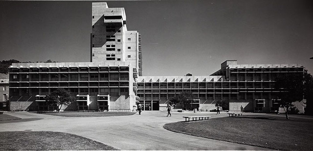
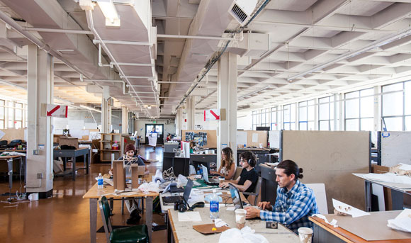
A few years after graduation, I went back to Wurster to work. As an adjunct professor in the Department of Architecture in the mid-1980s, I taught graduate and undergraduate design studios. I also coordinated the Campus Planning Study Group, led by Dean Richard Bender. For the most part, I experienced Wurster Hall in the same ways I had as a student: the wide-open studio floors crammed with desks, extension cords, and student projects; the slow elevators; the men’s and women’s restrooms alternating on the midfloor landings of the tower fire stair. Although I still wasn’t paying much attention to the building, the “worst building on campus” comments continued unabated, and I occasionally rose to the building’s defense. As I had as a student, I found the building a congenial, community-oriented place, and I enjoyed being there (although I was often very cold in my ninth-floor office).
In the late 1990s, UC Berkeley began a long-term campuswide effort, the SAFER program, to correct seismic deficiencies in all its buildings. Structural assessment of Wurster Hall identified it as “very poor,” likely to fail in the event of a major earthquake. Wurster would become one of the first SAFER program projects.
I returned to Wurster in 1997, working for the Department of Architecture and then, a year or so later, moving to the Dean’s Office. Among my responsibilities were ones that brought the building into focus in new ways for me. I prepared the campus’s annual space survey for the Department of Architecture and the Dean’s Office, identifying and calculating use, area, and conditions of assigned space. For the Dean’s Office, I developed a comprehensive building program, interviewing building occupants and mapping building-wide uses. One semester I met with every class that met in the building and explained how to exit the building from that classroom in the event of an earthquake. As the seismic project got under way, I participated in additional program analysis and technical assessments. That the firm doing the seismic work (EHDD) was the successor firm of one of the architects who had designed the building (Joseph Esherick) helped us to understand some of the intentions of the building’s designers. Most significantly for this Wurster story, and for my career, I led the planning for the relocation of all programs and activities that occurred in Wurster. I dove deeper into the building’s rooms and spaces, since whatever happened in each one had to be replicated elsewhere during the construction project.
By the time I left CED in 2000 to become the campuswide surge planner, I knew more than anyone about what was in Wurster Hall and how the building worked (or didn’t work) for its users. I had been in every nook and cranny, every closet. I had spent time and talked to people in offices, studios, labs, libraries, and more. I had spent time with engineers and contractors evaluating building systems and with architects considering the building’s appearance. I felt like I owned the building and, now, when I heard those comments about Wurster as “the worst campus building,” I adamantly disagreed. I did have some support, however, for this perspective. Once Wurster had been identified as a “very poor” seismic risk, the design community began to weigh in on the building’s value. Initial engineering studies for Wurster’s retrofit recommended complex interventions with great visual and internal impact. Some campus leaders suggested that demolition and rebuilding might be a simpler, less costly way to address Wurster’s seismic safety issues, as well as its aesthetic and programmatic ones. The Bay Area architectural community thought otherwise, seeing the building as a valuable and important work of architecture by significant Bay Area architects. This view, which I shared, supported by the lower costs of a retrofit compared with replacement, eventually prevailed.
I started my new position as campuswide surge planner knowing everything about Wurster but not much about other campus buildings and, especially, very little about the other midcentury campus buildings. Over time, I got to know almost every building on the Berkeley campus, and I developed an even deeper appreciation of Wurster Hall.
By the time I retired, as Berkeley’s campus planner and architect, I had a carefully honed presentation about Wurster that I gave untold times: on campus tours for the AIA, ASLA, and other professional organizations; for the new faculty orientation each year; for deans and provosts and chancellors. I was a cheerleader for Wurster, attempting, one talk at a time, to dispel the “worst building on campus” characterization. At my retirement party, which took place at Wurster Hall, I handed out a card with the main points I always made in those talks.
It’s important, I always began, to look at Wurster and to consider what I called its “context of ideas.” (Sometimes I wonder if I should copyright this phrase, I’ve used it so often. I believe it’s an important way to understand almost all architecture, in particular the architecture from the 19th century to the present—the architecture that defines U.S. campuses.) The architecture of Wurster Hall reflects four important ideas that, together, underscore the building’s architectural significance. (An aside: I believe that context is more than the explicit physical attributes of a building’s surroundings. My 1979 M.Arch design thesis took the Oakland YWCA, designed by Julia Morgan, as a case study for broadening the definition of historic context to include cultural, political, and even literary social history when designing an addition to a historic building.)
The context of ideas so critical in understanding Bauer Wurster Hall focused on four points.
The building’s architects: Vernon DeMars, Joseph Esherick, and Donald Olsen. These men were all midcentury modernists, but each approached modernism in a different way. They were not partners and, indeed, had never worked together before (and never did after). Theirs was a one-time, arranged collaboration (by William Wurster), something I often referred to as a shotgun marriage. In many settings today, sometimes even in the design professions, we see these kinds of singular partnerships. People (not firms) come together for individual projects based on their skills, interests, and, occasionally, the demands of clients. Even without knowing much about the personal interactions among these three architects when they worked together, we can say that the building represents a shared design process—something common today, but innovative back then.
It’s not inconsequential that the best spaces in this building are the student spaces, the wide-open studio floors of the tower. The designers prioritized student learning. Sometimes I described this as reflecting the post–World War II “democratization of higher education,” by which I meant that higher education was accessible to many more students. Architecture was beginning to open its doors more widely. Wurster Hall, with its expansive views north and south from the studio floors, underscored that openness. Notably, unlike other campus buildings from the same period, faculty offices here were among the worst spaces in the building: small, shared, and on the lower floors, with no views.
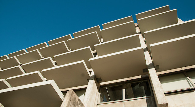
Then there were those sun shelves, the brise-soleil. Sun shading is now taken for granted. But in the late 1950s and early 1960s, when Wurster Hall was being designed, before “sustainability” was a watchword, Wurster’s brise-soleil was a remarkable—and highly unusual—response to solar gain on the building’s south and west elevations. Yes, yes, the brise-soleil was concrete and cantilevered; and, with insufficient attachment, it did have to be reinforced as part of the seismic project. But it is significant that three modernists made an environmental response—the very dramatic forms of these sun-shading devices—one of the defining elements of the building design.
The formal design of the building—what you see—ties all of this together. Those three modernists did not ignore capital A architecture, connecting ideas to art. The balanced asymmetry of the building’s geometry provides both for drama (the asymmetry) and for repose (the balance). The material (concrete) was bold and contemporary, and it was used in unusual ways, not only for the brise-soleil, but also in its structural design. (That structural design, however, innovative at the time, is what led to the urgent need for Wurster’s seismic retrofit as structural engineers learned more about how concrete buildings behaved during earthquakes.)
An undated, unsigned rendering I have from the period of Wurster’s design looks west at the building between a leafy, overhanging tree and a jungle of plants at the ground. The building is set in a kind of fantastical, almost romantic, landscape. Wurster’s modernist architects were deeply attentive to landscape and how open space and building together created settings for gathering and community—here, the courtyards east and west of the building. Whatever the renderer’s intent with this drawing, I have always seen it as confirming my understanding of the campus: that the campus is a mediated conversation between the natural landscape and the buildings. This is, perhaps, clearest with the Classical Core structures. But in this rendering, Wurster Hall’s modern grace holds its own, making a statement about its design that encompasses both its physical character and the context of its ideas.

Emily B. Marthinsen FAIA, is former Assistant Vice-Chancellor/Campus Architect, U.C. Berkeley. She is an advisor to the region and to community organizations on transit and housing. Click here to read other articles by Ms. Marthinsen published by Common Edge.

Common Edge is a nonprofit organization dedicated to reconnecting architecture and design with the public that it’s meant to serve. Its mission is to advocate and report on public engagement in the planning and design of the built environment, with an emphasis on some important questions that some younger designers and architects are asking, like: How can planning and design better express the wants and needs of everyday people? How can we make the process of creating and designing more democratic? How can we tell the public’s stories in more meaningful ways? How do we accomplish all that in the context of climate change, the most profound challenge facing us? The editorial team gratefully acknowledges Common Edge’s support of Northern News through granting permission to republish this article.
